New Mr Vegas Branding Makes Fun of Rivals

A new online casino operator, which is to be licenced in Malta but will target markets across Europe, has begun life by causing somewhat of a titter within the industry after having clearly made fun of a couple of their would-be rivals right from the off.
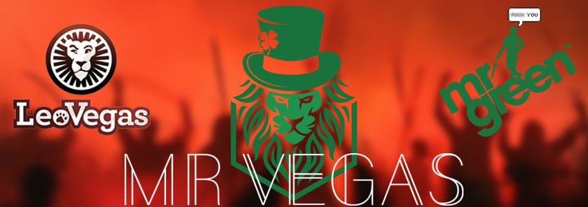
Mr Vegas, which is almost a portmanteau of major brands Mr Green and Leo Vegas, has published its brand-new logo which shows a lion wearing a top hat.
The lion is close to the image used by Leo Vegas, while the green top hat is a clear reference to Mr Green, though while the logo is obviously intended to be a harmless funhouse image of the combined brands it has not gone down too well with certain people who have taken to squabbling over the move.
Mr Vegas Logo Legally Sound
While to anyone with eyes it is clear what this new brand is trying to do, much in the same way that brands such as Ryanair or Paddy Power have chosen a rather cheeky style of advertising in the past within their industries, what really matters is whether they have legally done anything wrong. It appears they have not.
There is a depiction of a lion within the new logo, but it does not look like the Leo Vegas lion and that brand has no monopoly over images of that particular beast.
The emblem also features not only a hat, but a green one, however the mysterious Mr Green wears a bowler hat while this one is a top hat so once again most jurisdictions would not count this as being derivative to the point of stepping over the line in a legal sense.
So given that no brand can lay sole claim to lions and hats, or the colour green for that matter, this image is sound with the only question remaining being whether they have deliberately intended to wind these two brands up or whether they are simply going for some shameful name, colour and image recognition.
A “New” Brand People Will Recognise
While this may damage the egos of the marketing departments and boardrooms of Leo Vegas and Mr Green, the fact is that the vast majority of casual casino gamblers don’t take too much notice of the intricacies of branding and logos. Often, they simply want to bet with a brand they instantly feel is establish and that they can trust.
So, seeing the lion staring out of the screen on comparison and affiliate sites, or scrolling through and noticing a familiar green hat will strike a semi-conscious chord with players and make this logo automatically seem trustworthy as one they “think they’ve seen before”.
For what it’s worth, these considerations were probably at the forefront of the designers’ minds when coming up with this branding, though they at least must have been aware that in releasing it there would be a certain amount of discontent within the ranks of Leo Vegas and Mr Green respectively.
Whatever the reasons for this logo, it has definitely got us all talking and it seems to have quickly made Mr Vegas a favourite within the sector given the tongue-in-cheek nature of the release. So, within an industry that has unfortunately begun to take itself all too seriously at times, it is great to see.